AE 10: Trends in instructional staff employees in universities
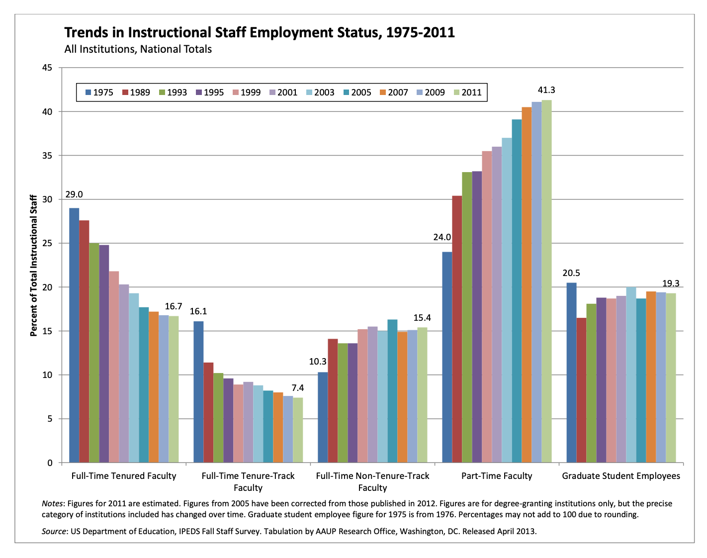
The American Association of University Professors (AAUP) is a nonprofit membership association of faculty and other academic professionals. This report by the AAUP shows trends in instructional staff employees between 1975 and 2011, and contains the following image. What trends are apparent in this visualization?
Packages
Data
Each row in this dataset represents a faculty type, and the columns are the years for which we have data. The values are percentage of hires of that type of faculty for each year.
staff <- read_csv("https://sta199-s24.github.io/data/instructional-staff.csv")
staff
# A tibble: 5 × 12
faculty_type `1975` `1989` `1993` `1995` `1999` `2001` `2003` `2005` `2007`
<chr> <dbl> <dbl> <dbl> <dbl> <dbl> <dbl> <dbl> <dbl> <dbl>
1 Full-Time Tenu… 29 27.6 25 24.8 21.8 20.3 19.3 17.8 17.2
2 Full-Time Tenu… 16.1 11.4 10.2 9.6 8.9 9.2 8.8 8.2 8
3 Full-Time Non-… 10.3 14.1 13.6 13.6 15.2 15.5 15 14.8 14.9
4 Part-Time Facu… 24 30.4 33.1 33.2 35.5 36 37 39.3 40.5
5 Graduate Stude… 20.5 16.5 18.1 18.8 18.7 19 20 19.9 19.5
# ℹ 2 more variables: `2009` <dbl>, `2011` <dbl>Recreate
- Your turn: Recreate the visualization above. Try to match as many of the elements as possible. Hint: You might need to reshape your data first.
staff_long <- staff |>
  pivot_WHATGOESHERE(

    #WHAT GOES HERE?

  ) |>
  ## Input line breaks as done in the reference plot
  mutate(faculty_type = str_wrap(faculty_type, 20),
         faculty_type = fct_relevel(faculty_type,
                                    c("Full-Time Tenured\nFaculty",
                                      "Full-Time\nTenure-Track Faculty",
                                      "Full-Time\nNon-Tenure-Track\nFaculty",
                                      "Part-Time Faculty",
"Graduate Student\nEmployees")))ggplot(
________,
aes(x = _______,
y = _______,
fill = ____
)
) +
geom_col(position = _____) +
scale_y_continuous(breaks = seq(5, 45, 5), limits = c(0, 45)) +
labs(
x = NULL,
y = "Percent of Total Instructional Staff",
fill = NULL,
title = "Trends in Instructional Staff Employment Status, 1975-2011",
subtitle = "All Institutions, National Totals",
caption = "Source: US Department of Education, IPEDS Fall Staff Survey"
) +
## to replicate (more or less) exactly...
theme(
legend.position = c(0.4, 0.93),
legend.direction = "horizontal",
legend.key.size = unit(0.2, "cm"),
legend.key.height = unit(0.1, "cm"),
legend.text.align = 0,
legend.background = element_rect(color = "black", linewidth = 0.2),
legend.text = element_text(size = 7),
panel.grid.minor = element_blank(),
panel.grid.major.x = element_blank(),
plot.caption = element_text(size = 8, hjust = 0)
) +
guides(fill = guide_legend(nrow = 1))Represent percentages as parts of a whole
- Demo: Recreate the previous visualization where the percentages are represented as parts of a whole.
ggplot(
  staff_long,
  aes(x = faculty_type,
      y = percentage,
      fill = _________
      )
  ) +
  geom_col(position = _______, color = "white", linewidth = 0.2) +
  scale_y_continuous(labels = label_percent()) +
  labs(
    x = NULL,
    y = "Percent of Total Instructional Staff",
    fill = NULL,
    title = "Trends in Instructional Staff Employment Status, 1975-2011",
    subtitle = "All Institutions, National Totals",
    caption = "Source: US Department of Education, IPEDS Fall Staff Survey"
  ) +
  theme(
    legend.text.align = 0,
    legend.background = element_rect(color = "black", size = 0.2),
    legend.text = element_text(size = 7),
    panel.grid.minor = element_blank(),
    panel.grid.major.x = element_blank(),
    plot.caption = element_text(size = 8, hjust = 0)
  )
Place time on x-axis
- Demo: Convert the visualization to a line plot with time on the x-axis.
ggplot(
  staff_long,
  aes(x = _____,
      y = _______,
      color = _______,
      group = _________
      )
  ) +
  geom_?(_________) +
  labs(
    x = NULL,
    y = "Percent of Total Instructional Staff",
    color = NULL,
    title = "Trends in Instructional Staff Employment Status, 1975-2011",
    subtitle = "All Institutions, National Totals",
    caption = "Source: US Department of Education, IPEDS Fall Staff Survey"
  ) +
  scale_y_continuous(labels = label_percent(accuracy = 1, scale = 1)) +
  theme(
    legend.key.height = unit(1.5, "cm"),
    plot.caption = element_text(size = 8, hjust = 0)
  )
Pay attention to variable types
- Question: What is wrong with the x-axis of the plot above? How can you fix it?
Add response here.
- Your turn: Implement the fix for the x-axis of the plot.
# add code hereUse an accessible color scale
- Question: What do we mean by an accessible color scale? What types of color vision deficiencies are there?
Add response here.
Demo: What does the plot look like to people with various color vision deficiencies?
Demo: Remake the plot with an accessible color scale.
# add code hereUse direct labeling
-
Demo: Remove the legend and add labels for each line at the end of the line (where
xis themax(x)recorded).
ggplot(
  staff_long,
  aes(x = year,
      y = percentage,
      color = faculty_type,
      group = faculty_type
      )
  ) +
  geom_line(linewidth = 1, show.legend = FALSE) +
  geom_text(
    data = staff_long |> filter(year == max(year)),
    aes(x = year + 1, y = percentage, label = faculty_type),
    hjust = "left", show.legend = FALSE, size = 4
  ) +
  labs(
    x = NULL,
    y = "Percent of Total Instructional Staff",
    color = NULL,
    title = "Trends in Instructional Staff Employment Status, 1975-2011",
    subtitle = "All Institutions, National Totals",
    caption = "Source: US Department of Education, IPEDS Fall Staff Survey"
  ) +
  scale_y_continuous(labels = label_percent(accuracy = 1, scale = 1)) +
  theme(
    plot.caption = element_text(size = 8, hjust = 0),
    plot.margin = margin(0.1, 2.5, 0.1, 0.1, unit = "in")
  ) +
  coord_cartesian(clip = "off") +
  scale_color_colorblind()
Use color to draw attention
- Demo: Redo the line plot where Part-time Faculty is red and the rest are gray.
ggplot(
  staff_long,
  aes(
    x = year,
    y = percentage,
    color = faculty_type_color, group = faculty_type
    )
  ) +
  geom_line(linewidth = 1, show.legend = FALSE) +
  geom_text(
    data = staff_long |> filter(year == max(year)),
    aes(x = year + 1, y = percentage, label = faculty_type),
    hjust = "left", show.legend = FALSE, size = 4
  ) +
  labs(
    x = NULL,
    y = "Percent of Total Instructional Staff",
    color = NULL,
    title = "Trends in Instructional Staff Employment Status, 1975-2011",
    subtitle = "All Institutions, National Totals",
    caption = "Source: US Department of Education, IPEDS Fall Staff Survey"
  ) +
  scale_y_continuous(labels = label_percent(accuracy = 1, scale = 1)) +
  scale_color_identity() +
  theme(
    plot.caption = element_text(size = 8, hjust = 0),
    plot.margin = margin(0.1, 2.5, 0.1, 0.1, unit = "in")
  ) +
  coord_cartesian(clip = "off")
We could keep going…
Let’s go back to the slides for that.